

Branding + Art Direction + Packaging + Illustration
Located in Dripping Springs, Texas, Texas Hill Country Olive Co is the state's premier certified organic olive oil producer. We pride ourselves on quality, authenticity, and sustainability, offering locally sourced, freshly pressed extra virgin olive oil and a variety of high-quality products.
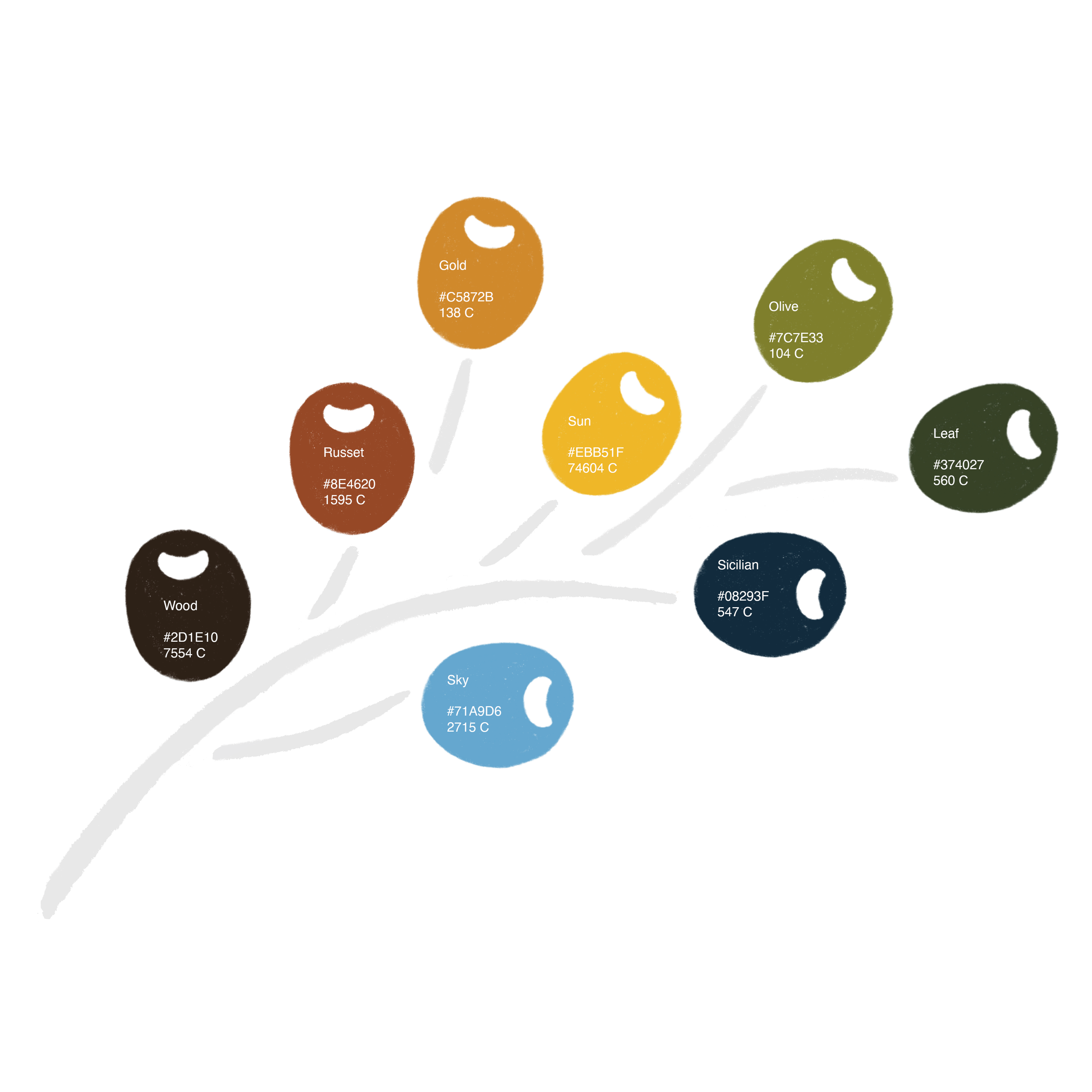
The rebrand of Texas Hill Country Olive Co reflects authenticity, craftsmanship, and the natural beauty of the Texas Hill Country, inviting customers to enjoy locally sourced olive oil and premium products.
Project Roles:
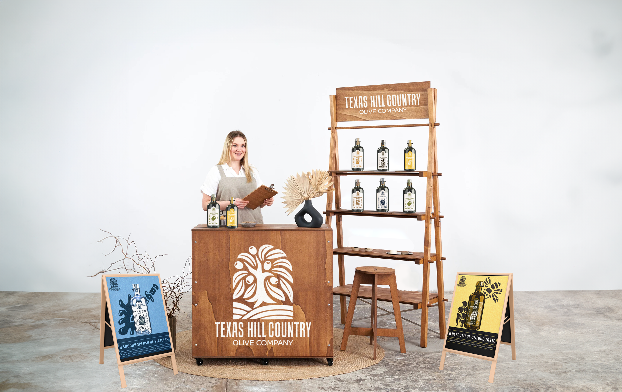
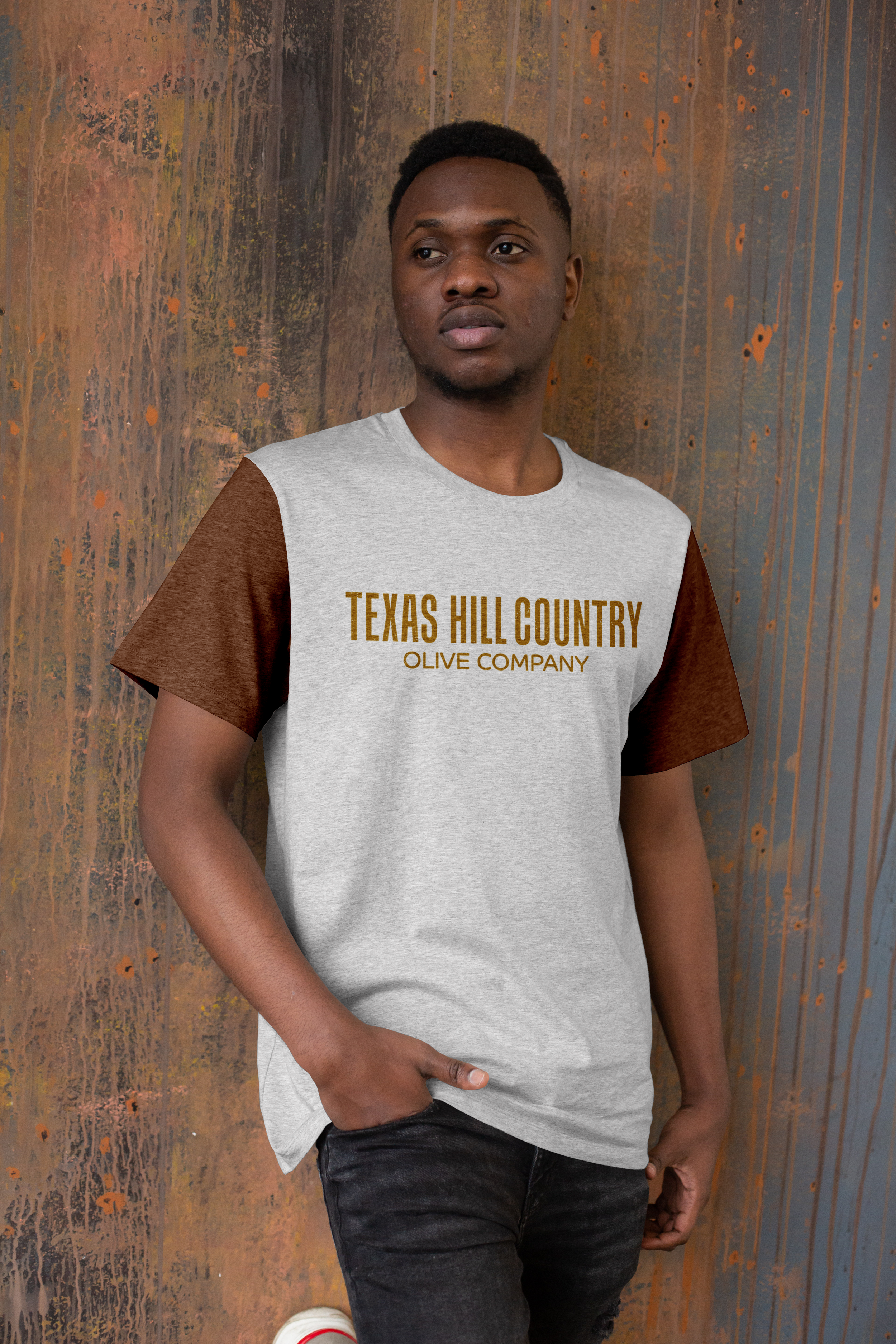
Jeanette Deegear: Research/Logo/Illustrations/Packaging/Label/Brochure/MerchandiseMiranda Allman: Research/Bottle/Label/Packaging/Van/Pop up/Farmers Market/Merchandise/Social Media
Jared Munoz: Research/Poster Design/Merchandise/Website
Jared Bloom: Research/Merchandise/Website
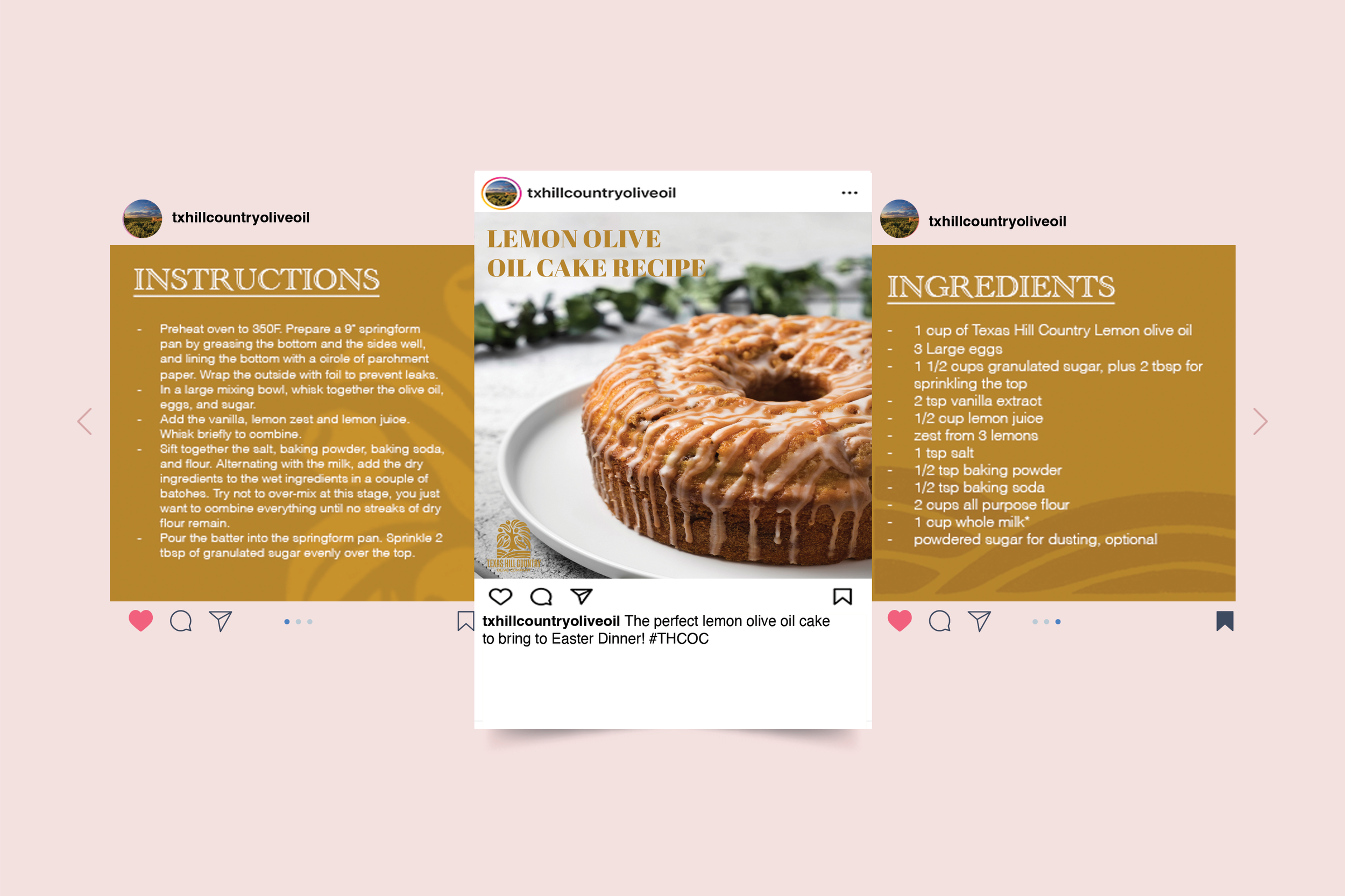
Photo Credit: Texas Hill Country Olive Co, Freepike, Unsplash & Pexels.
Current Primary Trademark
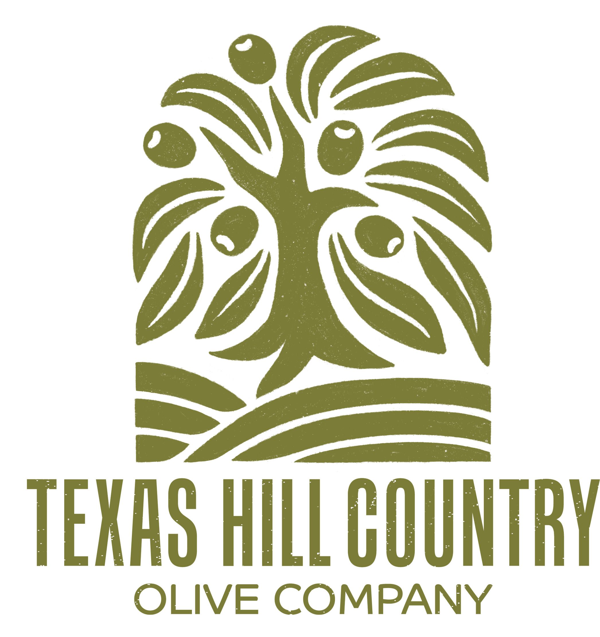
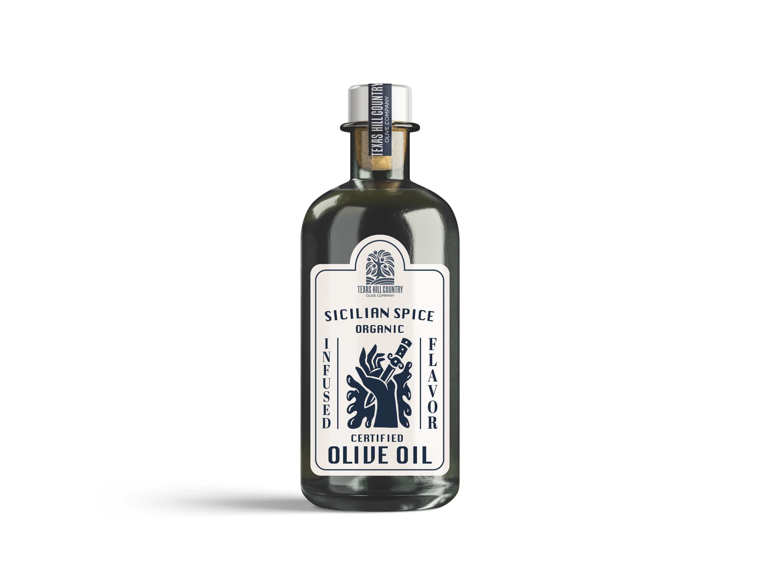
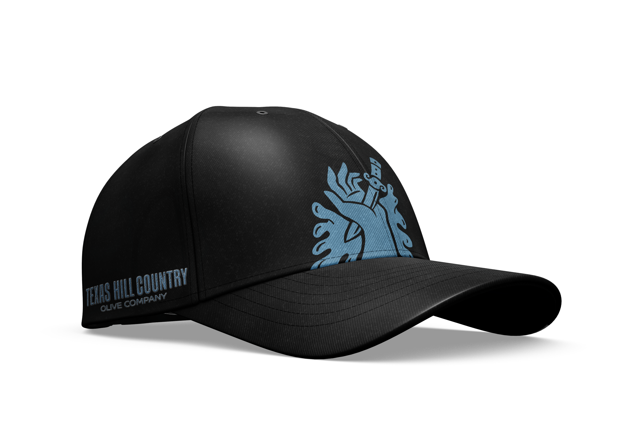
The tree logo was reimagined in an organic, block print style, incorporating Texas hills to maintain the local feel. The elongated Tendelle typeface was chosen to reflect the tree’s leaves and trunk, while the rounded Co font echoed the olives and hills. The label illustrations followed the same block print style with a subtle grain.
Proposed Primary Trademark


Current bottle/label design
Proposed bottle/label design