

Branding + Art Direction + Packaging

Welcoming a sudden shower thought brought to life, IQONIC, a probiotic vodka soda. The brand design of IQONIC strikes a balance between sophistication and vitality, appealing to consumers of the age 21+ who seek a modern, health-conscious beverage without sacrificing taste or style.
Incorporating "IQ" for intelligence and "Iconic" for something highly regarded or iconic creates a memorable and meaningful brand name. It effectively communicates the idea of a smart and distinguished beverage. This combination not only captures attention but also conveys the essence of the brand as innovative and noteworthy.
The can design is sleek and modern, with clean lines and a premium feel. Visual elements on marketing materials and advertisements include images of lively probiotic cultures and a young vintage photo style that is timeless.
The messaging focuses on the intelligent choice of drinking with IQONIC, such as “The smart way to drink,” “Happy hour cheat sheet.”. It emphasizes the fusion of flavor and function, highlighting the health benefits of probiotics without compromising on taste or enjoyment.
Project Role
Completed as a solo project.
This project is in the process of being expanded for branding and art direction. It’s going to be IQONIC!


The typeface used for the logo Corela gives the brand a modern, sleek look with curves that mimic the shape of probiotics. The secondary type Montserrat it’s a reliable choice for pairing with bold type because of its versatility, readability, and timeless design. It enhances the visual appeal of text while ensuring clarity and clean look.

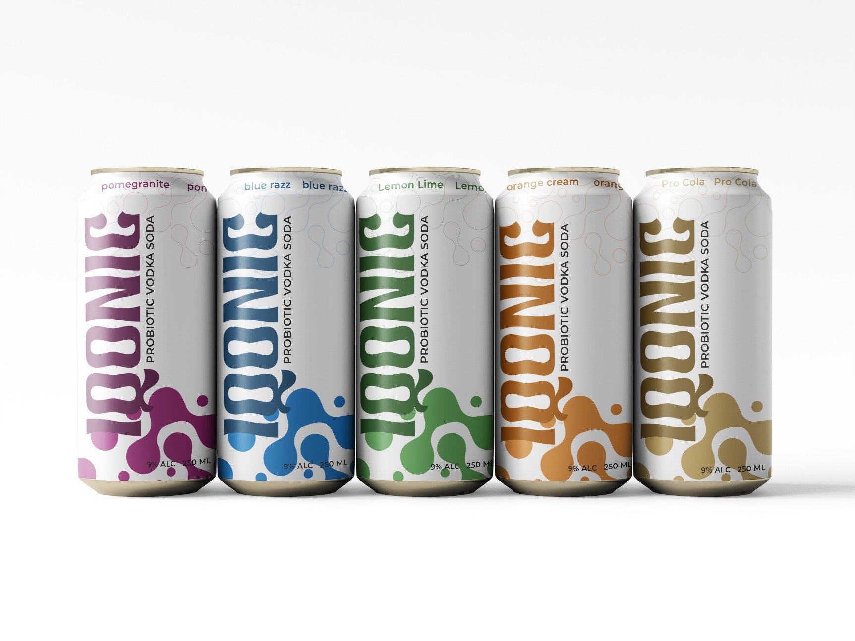
The color palette reflects freshness, health, and energy. With a pop of electric blues, energetic greens & oranges, bright pinks and relaxing cream to catch the eye and evoke the feeling of a refreshing drink.
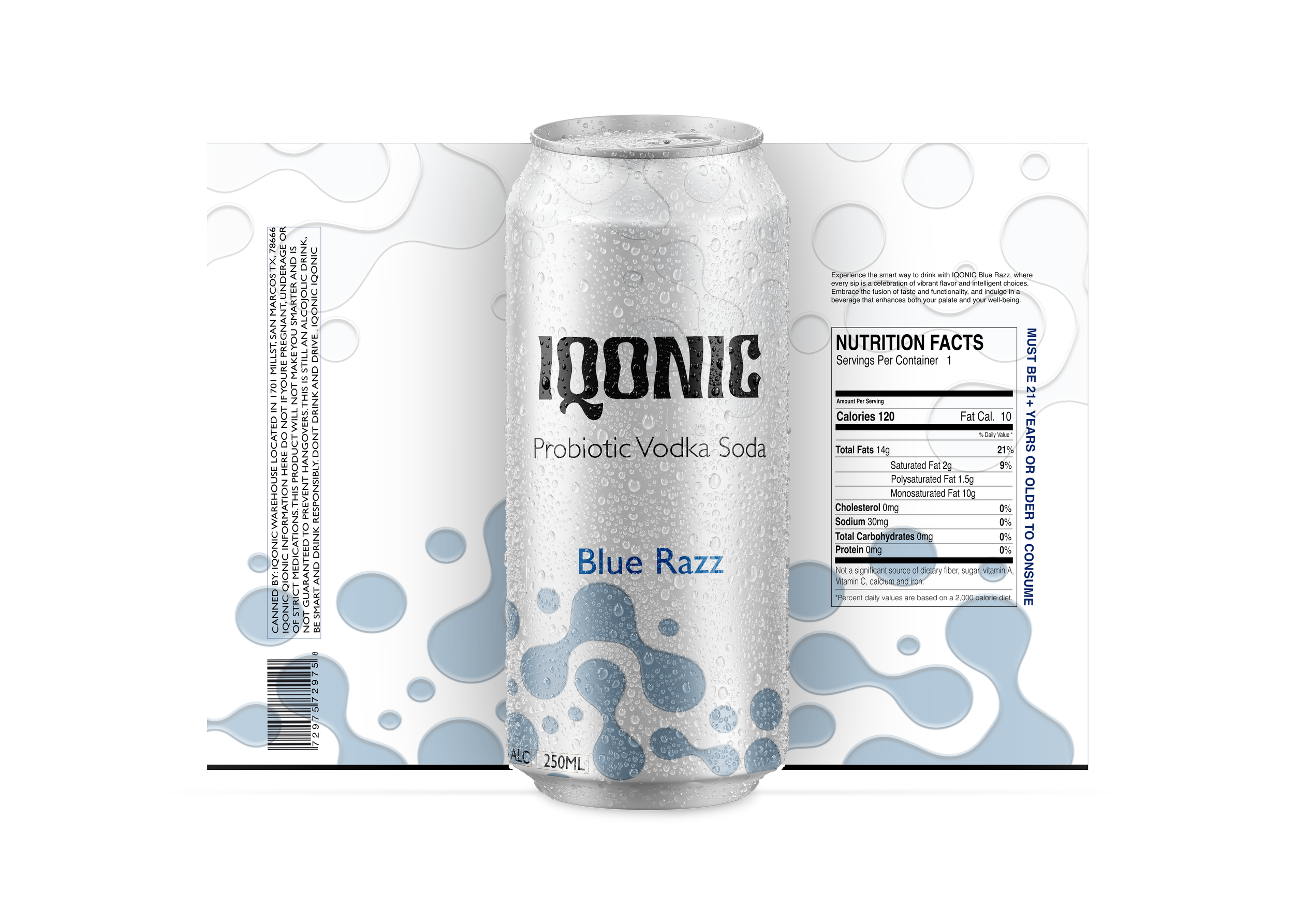
Old Proposed Can Design


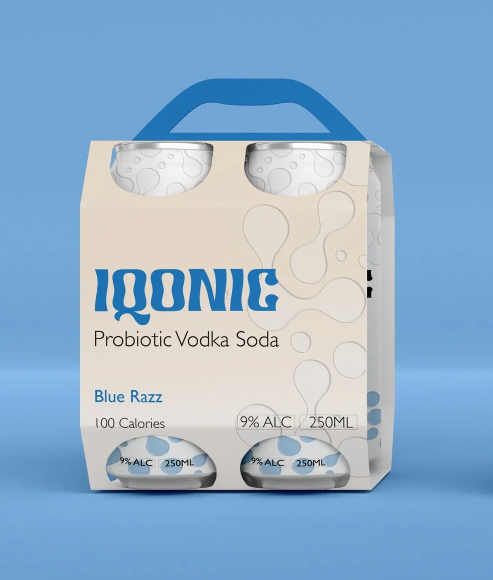

Old Proposed Packaging Design
New Proposed Packaging Design

